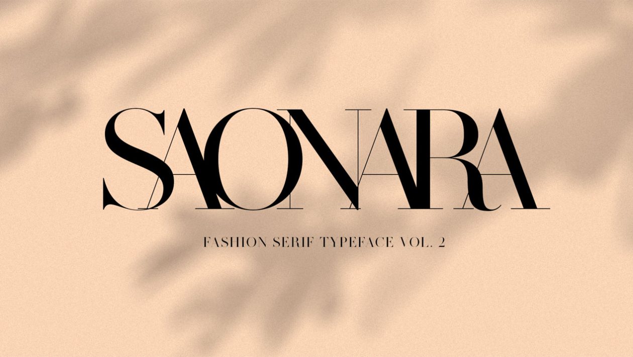
In the ever-evolving world of typography, where design trends come and go, serif fonts stand as enduring classics. These typefaces, known for their distinctive decorative strokes at the ends of letters, have a rich history and continue to play a pivotal role in both print and digital media. In this exploration of serif fonts, we uncover the timeless elegance, versatility, and enduring appeal of this typography style.
A Glimpse into Serif Font Heritage
The origins of serif font can be traced back to ancient Rome, where inscriptions carved into stone displayed the first instances of these decorative strokes. Serifs were not mere embellishments; they served a functional purpose by preventing chipping and wear along the edges of the letters.
One of the most iconic serif fonts with historical roots is Times New Roman, designed by Stanley Morison and Victor Lardent in 1931. Commissioned by The Times newspaper in the United Kingdom, this font became synonymous with the publication and was later adopted for widespread use in books, magazines, and documents. Its legibility and classic appeal have made it a staple in the world of typography.
The Distinctive Characteristics of Serif Fonts
What sets serif fonts apart from their sans-serif counterparts is, of course, the serifs themselves. These small strokes or lines adorn the ends of letters, creating a sense of continuity and flow. Serif fonts are further categorized into various styles, including:
- Old-Style Serifs: These fonts, such as Garamond and Caslon, have a classic, timeless feel. They feature irregular and slanted serifs and a subtle contrast between thick and thin strokes.
- Transitional Serifs: Fonts like Baskerville and Times New Roman fall into this category. They exhibit more pronounced serifs and a moderate contrast in stroke thickness, striking a balance between old-style and modern.
- Modern Serifs: Fonts like Bodoni and Didot are characterized by high contrast between thick and thin strokes and ultra-sharp serifs. They exude a sense of sophistication and elegance.
- Slab Serifs: Also known as Egyptian typefaces, slab serifs like Rockwell and Courier have bold, blocky serifs that create a strong, sturdy appearance. They are often used for headlines and branding.
The Versatility of Serif Fonts
Serif fonts offer a versatility that makes them suitable for a wide range of applications. Their classic and authoritative appearance lends itself well to printed materials like books, newspapers, and academic journals. The enhanced readability of serifs in long-form content makes them a popular choice for body text.
In recent years, serif fonts have also made a resurgence in digital design. Websites and apps are increasingly incorporating serifs to create a unique and sophisticated visual identity. The combination of clean, sans-serif headlines with serif body text provides a pleasing contrast that captures the viewer’s attention.
The Timeless Allure of Serif Fonts
What keeps serif fonts relevant and cherished throughout the centuries is their timeless allure. They possess a unique ability to evoke a sense of tradition, reliability, and refinement. Whether used in a contemporary website, a novel, or a formal document, serif fonts continue to communicate a sense of enduring quality.
In conclusion, serif fonts are not relics of the past but rather treasures of typographic design that continue to find their place in the modern world. Their rich history, distinctive characteristics, and versatility make them an invaluable tool for designers and a source of timeless elegance for readers. So, the next time you encounter a beautifully typeset book or a website with classic charm, take a moment to appreciate the enduring allure of serif fonts.


